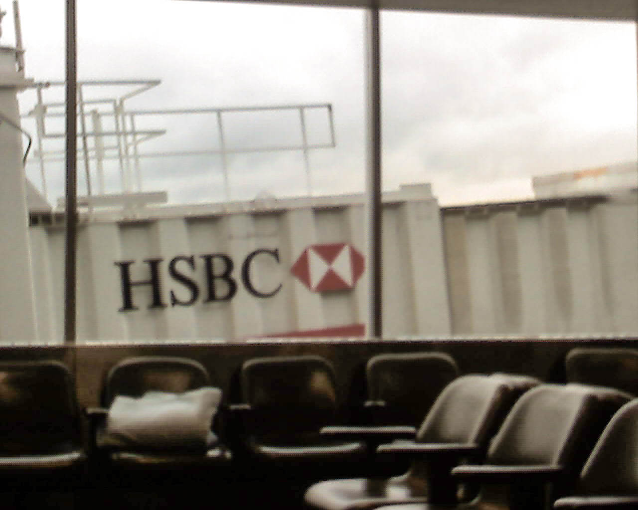
I went to Chicago on Tuesday, and as I was sitting at the gate waiting for my plane to board, I noticed something that is just plain annoying. I looked out the window and couldn’t help noticing that the jetway was positioned almost right up against the window. On it, in large letters, was the logo for HSBC (sorry for the crappy cell phone photo, but I didn’t have a real camera on me at the time).

Where does the line get drawn on advertising? Are we going to have street lamps festooned with advertisements? What about mailboxes? Maybe crosswalks should have some sort of advertising on them instead of just silly white lines?
What I find interesting is that HSBC would choose that place to advertise. Obviously, it’s a good place because people are stuck sitting in the gate area and will look out the window and see their name, but it really doesn’t make sense to advertise a banking company at that point because people are about to go into a closed environment for hours and I don’t think that banking will be on most people’s minds during that time. I would think something more travel related would be appropriate, but then again, I’m not in advertising so I may not understand the subtle intricacies of how this is a brilliant place for HSBC to advertise.
Eggs come with advertising etched on them, why shouldn’t everything? (in case you couldn’t tell, I’m being sarcastic)
